
Branding Product
There's always some great product stuck in a plain cardboard box with nothing to say. Yours won't be one of them.
Complex Design Studio builds product brands that feel whole — strategy, identity, packaging, stationery, apparel, and every physical touchpoint that actually sticks with people.
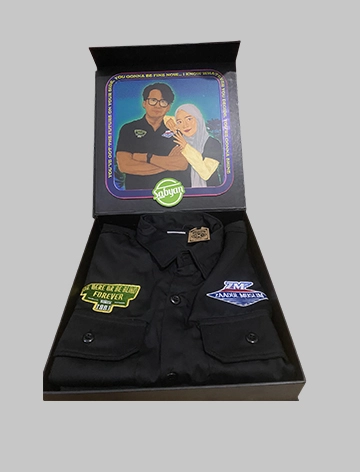
Sabyan Gambus
This project is a creative collaboration producing an exclusive gift merchandise set specially designed for the music group Sabyan Gambus (Zaadul Muslim / ZM). Our company held full responsibility from the visual concept exploration and digital illustration stages through to apparel manufacturing and premium-quality custom rigid packaging box production. This project blends local/religious cultural value with a modern retrowave / synthwave aesthetic touch, creating a product that is not only functional but also carries strong artistic and collectible value. <strong class="font-semibold text-gray-800">This project was made as a single exclusive piece and is not reproduced or sold by us, Complex Design, and Zaadul Muslim (ZM).</strong> COMPONENT DETAILS & PRODUCT SPECIFICATIONS A. Custom Workshirt / Premium Work Shirt ("Zaadul Muslim / ZM") Concept & Design: A tactical/streetwear-style workshirt in deep black, designed to be durable, masculine, yet still elegant. Embroidery Detail (Patches): Right chest: An emblem-shaped embroidered patch reading "BE HERE OR BE BLIND FOREVER - SINCE 1991," in olive-green with a gold-yellow border. Left chest: A geometric embroidered logo patch "ZM - ZAADUL MUSLIM" combining blue, white, and red in a retro-racing style. Embroidery craftsmanship uses high-density computer embroidery techniques to ensure the lettering is sharp, neat, and long-lasting. Features & Material: Cotton Drill / Tropical Premium fabric that is cool, tightly woven, and comfortable for both indoor and outdoor activities; double chest pockets with button flaps; and double-stitch construction in critical areas for extra durability. B. Digital Poster Illustration & Artwork (Retrowave Style) Art Concept: A combination of digital painting technique with a Retrowave / Cyberpunk Synthwave visual aesthetic in an 80s/90s style. Character Illustration: Digital portraits of Sabyan Gambus members (Nissa Sabyan & Ayus Sabyan), drawn with close attention to expression detail, clothing folds, and lighting. Visual Concept & Effects: Glowing neon-style typography with a chrome/metallic effect reading "Sabyan" in futuristic Arabic/Latin script. The background features a night-city cyberpunk landscape, starry sky, neon-lit architecture, and a quote border line, using deep navy, purple, and magenta light-effect tones. Dominant magenta, electric blue, neon purple, and deep midnight-blue accents deliver an 80s nostalgic yet futuristic feel. C. Exclusive Hardbox Packaging & Inner Artwork Print Packaging Concept: An exclusive Magnetic Hardbox / Premium Gift Box made from thick material, delivering a luxurious, sturdy impression designed to create a memorable unboxing experience. Outer Cover Design: A matte-black (doff finish) base color with sharp printed artwork on the main lid featuring a gold Garuda symbol perched atop a ribbon bearing the brand slogan, the typography "Zaadul Muslim - ZM Workshirt - Finest Made," and the printed slogan "LOCAL WISDOM" on the side of the box. Interior Design: Inside the box lid, a full-color digital Retrowave Sabyan artwork print is precisely mounted, greeting the recipient before they access the shirt product inside. VALUE ADDED & PRODUCT ADVANTAGES A. Integrated End-to-End Creative Solution: We develop the concept from raw ideas and provide a comprehensive solution - from art direction and digital illustration through to garment manufacturing and packaging production - handled internally to ensure consistency in color and quality. B. Exclusivity & Brand Identity: Applying a retrowave style to a nasyid/gambus music group creates a fresh, modern contrast positioning that strongly appeals to younger audiences without losing the core identity of the Zaadul Muslim brand. C. A Stunning Unboxing Experience: Transforming simple packaging into a highly collectible work-of-art medium. D. Industry Quality Standards: From embroidery thread density and print color accuracy through to sturdy hardbox structure, every detail is produced to international merchandise standards.
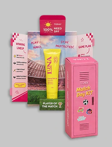
BEAUTYMAX KOSMETIKA BERJAYA (LUNA)
1. PROJECT SUMMARY In the highly competitive cosmetics and skincare industry, packaging serves not only as product protection but also as the primary visual communication medium for conveying brand messaging. PT. BEAUTYMAX KOSMETIKA BERJAYA entrusted us with an Exclusive Custom Box project for their newest product line, LUNA Sunny Set Go Sunscreen SPF 30 PA+++. This product is specially formulated to maintain skin hydration while protecting it from UV exposure during intense outdoor activity. The central challenge of this project was integrating a "Football / Match Day" sports theme with the beauty industry's demand for an elegant, clean, premium aesthetic. The innovative solution was an interactive Locker Room–structured packaging design — replicating a football player's changing room — that delivers a theatrical, memorable unboxing experience for consumers. 2. STRUCTURAL CONCEPT & UNBOXING EXPERIENCE This packaging was engineered with a precise structural architecture to create physical interaction upon opening: Outer Structure (Outer Box – Locker Door): When closed, the front face presents a replica of a tactical locker door, complete with air-ventilation detailing characteristic of a stadium changing room, casual-style sticker ornaments, and the LUNA Match Day Kit logo. The opening mechanism uses a precise center double-door system, conveying an impression that is both elegant and sturdy. Inner Structure (Inner Box – Stadium Center Stage): Once the "locker" door opens, consumers are presented with a grand changing-room interior visual, featuring a full football stadium backdrop at the center and a stretch of green turf at the base. The sunscreen product stands upright at center stage on a dedicated stand inscribed "Player of the Match" — positioning the product as the star player of this skincare match. 3. LAYOUT DETAIL & VISUAL COMMUNICATION The graphic layout was comprehensively designed so that every inch of the packaging serves an informative and persuasive function: Inner Left Panel (Pre-Match Checklist): Functions as an interactive reminder for users before heading out under the sun. The checklist covers the essentials — Jersey, Sneakers, Water Bottle — closing with the crucial final step: applying LUNA Sunny Set Go Sunscreen. Inner Right Panel (Game Plan): Delivers product-usage education through an easy three-step guide (Apply, Blend, Reapply) to ensure optimal skin protection ("100% Need SPF"). Outer Side Flap (Product Highlights): Elegantly reinforces the product's formula strengths through a vertical text series — LIGHTWEIGHT, NON-STICKY, DEWY FINISH — alongside an infographic of active ingredients (Centella Asiatica, Honey Extract, Green Tea Extract). PRODUCTION SPECIFICATIONS & FINISHING To meet PT. BEAUTYMAX KOSMETIKA BERJAYA's request for a luxurious, high-class packaging feel, the production-sample (mock-up) execution applied the highest manufacturing standards: Base Material: Premium Art Carton / Ivory Board at high grammage (310–350 gsm), ensuring the structural strength of the locker-fold construction without risk of tearing. Print Technique: High-resolution offset printing with CMYK + custom Pantone calibration, producing a bright yet soft, iconic pink tone. Primary Finish: Full matte lamination (doff) across both outer and inner surfaces. The matte layer delivers a smooth soft-touch texture, reduces excess light reflection, and instantly elevates the box's aesthetic to premium-product standard. Color Harmony: High contrast between the base pink and the football pitch's green turf, creating a striking visual surprise the moment the packaging is opened. 4. STRATEGIC VALUE FOR COMPANY PROFILE The success of this project reflects our company's capability to execute complex concepts into tangible, high-value products. It demonstrates our competence across several key dimensions: Structural Engineering Capability — Stepping beyond conventional box boundaries to create a precise, functional, interactive structure shaped like a locker-room changing cabinet. Thematic Graphic Design Precision — Successfully merging two contrasting worlds — the masculine, dynamic world of football and the elegant world of aesthetic skincare — into one harmonious design. Mock-up & Production Quality Standards — The use of matte-lamination techniques and precise die-cutting in the production sample ensures the on-screen design translates exactly into the final physical packaging.
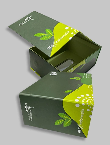
iFlex Indonesia
1. PROJECT SUMMARY In an exclusive collaboration project with iFlex Indonesia (under the national Wonderful Indonesia campaign), our company was entrusted with designing and producing a premium packaging solution (Premium Gift Hardbox) for the "Tan Baron Tea" product. The main challenge of this project was creating packaging that not only carries strong visual aesthetic value to represent the brand identity, but also delivers a sustainability aspect. Our innovative solution was a functional box structure that can be repurposed into an exclusive tissue box once the main product inside has been used up. KEY PRODUCT SPECIFICATIONS: Product Category: Rigid / Hardbox packaging with dual functional features (Gift Box & Tissue Box). Client: iFlex Indonesia - Wonderful Indonesia (Brand: Tan Baron Tea). Special Feature: Oval die-cut opening on top with magnetic closure/pull-ribbon, precision structure for functional re-use. Visual Theme: Fresh natural bottle-green and lime-green tones with a dynamic, modern wave/circular graphic pattern. 2. WORKFLOW & PRODUCTION MANAGEMENT PROCESS (END-TO-END WORKFLOW) We apply strict, integrated operational standards from upstream to downstream to ensure the final product's precision matches the client's requirements: Stage 1: Structural Engineering & Box Construction The process begins with structurally designing the die-cut pattern (dieline). We calculate the board material thickness to ensure strong mechanical durability as a gift box, while also having proportional dimensions when repurposed as a standard tissue box. On the top lid, a precise oval/elliptical die-cut pattern is created as the tissue pull-out channel. Stage 2: Graphic Design & Layout Mapping (Graphic Layout & Pre-Press) Once the structure is approved, our design team applies the visual assets and logos of iFlex Indonesia and Wonderful Indonesia into the print layout (layouting). This stage involves meticulous color adjustment to ensure gradient transitions and curved organic line elements print perfectly on every side of the box. The "Tan Baron Tea" text layout is positioned to remain proportional both when the box is closed and when it is used as a tissue box. Stage 3: Pre-Press Process & Mockup Approval (Mockup Approval & Quality Control) In line with our work standardization (as stated in the company's SPK/work-order instruction sheet), we first produce a physical 1:1 scale mockup for the client's sign-off. The review process covers SPK Detail checks, color proofing, Print FA Preview, requesting sign-off approval of the print plate, as well as die/cutting-die verification before moving to mass production. Stage 4: Mass Production & Premium Finishing (Mass Production & Finishing) The production process uses high-quality offset printing machines to maintain accurate reproduction of the distinctive corporate green. The printed sheets are laminated with a premium-quality Doff/Matte layer to create an elegant impression, a smooth soft touch, and freedom from artificial light reflection. The final process involves manual assembly (hand-crafted gluing) of the outer sheet onto a thick rigid board to ensure corner strength and long-term durability. 3. VALUE ADDED & COMPETITIVE ADVANTAGE (VALUE PROPOSITION) Eco-Friendly Design (Sustainable & Upcycling Design): Delivers a packaging solution that is not immediately discarded but instead becomes a useful desktop interior decoration, extending consumers' interaction time with the brand (brand recall). Rigid Durability: The use of premium materials ensures the product inside remains safe throughout the logistics and gift-delivery distribution process. High Print Accuracy & Precision: Strict control over the pre-press workflow guarantees consistent graphic color output.
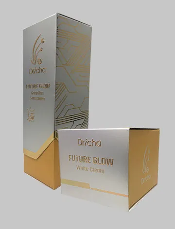
Dricha
In the premium cosmetics industry, packaging is not merely a protective vessel - it is the first representation of aesthetic value, brand identity, and the quality of the formula inside. This project focused on developing exclusive Hardbox packaging for the cosmetics brand Dricha, covering two of its flagship products from the future-facing series: Future Glow White Cream and Future Glow Guardian Sunscreen. The main challenge of this project was translating the "Skincare From The Future" vision into a physical form that is sturdy, functional, and possesses top-tier visual appeal. To achieve this, we were entrusted with the entire pre-production cycle - from structural print engineering (dieline) and precision graphic layout, through to production mock-up (physical sample) fabrication with complex finishing techniques - to ensure absolute accuracy before mass production begins. SCOPE OF WORK & TECHNICAL DETAIL A. Structural Engineering & Dieline Development A crucial first step involved designing a highly precise dieline construction for two different box structures: Main Container Structure (Inner Hardbox): Uses a cross-folding base system with precision internal fold-locking tabs. This structure is built from thick rigid board laminated with special premium paper to create a sturdy, protective effect and deliver a memorable unboxing experience when pulled out of its sleeve. Outer Sleeve Structure: A vertical box structure with a side-glued seam, featuring a special die-cut hole on the White Cream model and an angular asymmetric cut-out (v-shape) at the base of the Guardian Sunscreen sleeve, which exposes the gold inner box beneath in striking contrast. B. Layout Design & Print Readiness (Pre-Press Assembly) We comprehensively arranged the placement of graphic elements, legal information, and product information on the layout in line with cosmetics-industry standards, including: Front Face: Placement of the Dricha logo, product naming (Future Glow series), and protection claims (such as SPF 50+ PA++++ on the Sunscreen product) following the gold ink guide. Side & Back Faces: Detailed organization of legal text, covering the Usage Description, Instructions for Use, Full Ingredient Composition, Manufacturing Information (PT Tekno Biow Inovasi), barcode, the official Indonesian Halal logo with certification number, and the BPOM RI registration number (NA18241702684). FINISHING SPECIFICATIONS & MOCK-UP PRODUCTION To deliver a physical representation that is 100% accurate to the final mass-production result, we produced a physical sample (production mock-up) applying a combination of three premium finishing techniques: Matte Lamination (Doff): Applied across the entire silver-grey outer sleeve surface. Delivers a smooth textured effect, anti-glare finish, and protects the paper surface from scratches and fingerprints. Hot Stamp / Foil Stamping (Gold): Applied using shimmering gold foil on key elements - the Dricha logo, the "FUTURE GLOW" product title text, and the entire futuristic circuit-graphic pathway on the side panels of the packaging. Creates a high-contrast metallic shine against the matte base. Emboss (Raised Texture): Applied in precise register with the hot stamp on the Dricha logo and main text. The print result carries a tangible raised dimension when touched, reinforcing the tactile, premium impression of the packaging. VALUE ADDED FOR THE COMPANY PORTFOLIO The successful completion of this Dricha packaging project demonstrates our company's capability to execute high-complexity, High-End Packaging products. Our ability to align futuristic design aesthetics with the mechanical precision of box folding proves that we do more than simply design graphics - we deliver a comprehensive, safe, appealing packaging manufacturing solution that is ready for mass distribution in the global beauty industry.
Midnight Forest
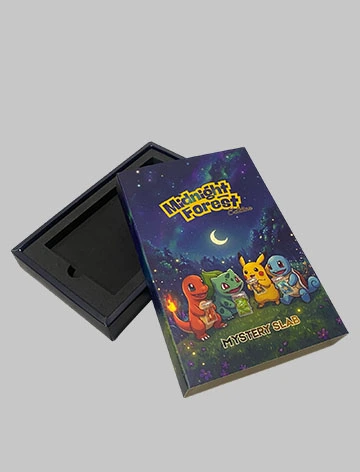
EXECUTIVE SUMMARY & PROJECT DESCRIPTION This project covers packaging structure design, production-ready layout development, and physical mock-up (prototype) fabrication for an exclusive packaging product named "Mystery Slab - Midnight Forest Edition." This product is designed specifically as a premium sliding-box container for high-value Pokémon cards that have undergone official grading (Graded Pokémon Slab by authoritative bodies such as PSA, GM, GM Imperium, or EGS). The packaging's visual concept carries a magical night-forest landscape theme, adorned with an aurora starry-sky effect, glowing firefly light, and tree silhouettes that reinforce the sense of mystery. The front and back faces feature iconic Pokémon characters (Charmander, Bulbasaur, Pikachu, Squirtle) holding a mock slab, delivering a direct message to collectors about the contents and emotional value held within the box. SCOPE OF WORK & TECHNICAL DEVELOPMENT DETAIL A. Dieline Structure Development & Pre-Production Layout (Pre-Production Preview) The initial stage focused on engineering the packaging's cut-and-fold pattern (dieline structure) to ensure high precision during mass production. The structure used is a Sliding Box / Drawer Box, consisting of two main components: the outer sleeve and the inner tray. Fold Layout Structure: Accurately arranging graphic placement across the top sleeve area, the side spine, the back sleeve, and the glue flaps/tabs that support the packaging's adhesive strength. Safety Margin & Bleed: Applying a safe cutting boundary (bleed area) to anticipate die-cutting blade shifts during mass printing, so no blank white areas are left along the packaging edges. Technical Machine Guides: Defining dashed lines as fold (creasing) indicators and solid lines as cutting/dieline indicators for operation on automated printing and die-cutting machines. B. Exclusive Mock-up Development & Material Selection To ensure the product's visualization matches expectations before entering the mass-production line, a physical mock-up was developed to modern retail-industry rigid-box standards. Outer Sleeve Primary Material: Uses high-density paper (Ivory Paper 300 gsm) coated with a soft Doff/Matte lamination to bring out the depth of the "Midnight Forest" dark tones, combined with a Spot UV touch on the main logo for a premium shine effect. Inner Tray Structure (Inner Drawer): Uses a thick Rigid Yellow Board base material coated with deep-black textured paper, creating a sturdy construction, a solid weighted feel, and maximum impact protection. Inner Retention System (Inner Laser-Cut Foam Inlay): Fitted with high-density, deep-black EVA foam padding, precision-cut using a laser machine to form dedicated compartments that lock the Graded Slab perfectly in place to prevent shifting during distribution. Includes a finger notch to make card retrieval easier. SALES VALUE & RELEVANCE The success of this project demonstrates the company's comprehensive capability in handling the full product development cycle end to end. This project validates our expertise in: Precision Structural Engineering: The ability to create a functional packaging blueprint that combines security for high-value products with a memorable unboxing aesthetic. High-End Print Management: A deep understanding of large-scale dark-tone color print management (rich black balancing) and the application of special print finishing effects. B2B Premium Client Fulfillment: Successfully translating popular intellectual property (IP) such as Pokémon into third-party commercial packaging design while maintaining international industry quality standards. Capability Statement: Through the Mystery Slab Midnight Forest Edition project, we demonstrate high competency in delivering premium packaging solutions that serve not only as physical protection, but also as a medium for enhancing product sales value (value-added packaging) in the international collector market.
Mindonut
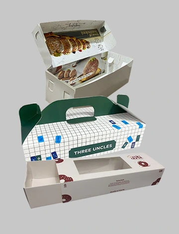
The bakery and donut culinary industry today demands product presentation that is not only hygienic but also capable of delivering a memorable unboxing experience for consumers. Mindonat's management set the challenge of designing and producing three new structural packaging variants: a Mailer Box, a Sliding Softbox (Sleeve-Drawer Box), and a Takeaway Box, with the main goal of elevating the aesthetic perception to be far more elegant, sturdy, and distinctly exclusive. SCOPE OF WORK In this project, our work capability covered every stage from pre-production through to the final physical sample, as follows: Dieline Structure Design: Creating a structurally precise cut-and-fold pattern (dieline), including a dedicated insert/grid slot to keep the product securely in place and prevent shifting during transport. Layout & Production Preview: Arranging the graphic layout, logo placement, decorative elements (donut/mahjong illustration patterns), and printed informational content (storage instructions, QR code, Halal logo) so that everything is precisely aligned on every fold surface. Physical Mock-up Production: Producing a 1:1 scale physical sample using genuine materials to verify the mechanical strength of the fold structure before mass production. Premium Finishing: Applying a high-quality matte (doff) lamination layer to deliver a velvety soft-touch effect, reduce light reflection, and improve resistance to water or oil. Design Aesthetic Approach: To achieve the requested elegant impression, we applied a high-aesthetic minimalist concept to the packaging's exterior (clean exterior), combined with a visual surprise on the inside (rich interior layout). This is clearly seen in the Mailer Box variant, which hides a full-color donut print behind its minimalist cover. DETAILED ANALYSIS OF PACKAGING PRODUCT VARIANTS Variant 1: Sliding Softbox (Sleeve-Drawer Packaging) This variant is specifically designed to deliver an instant premium impression. The sliding mechanism provides an elegant opening transition. Key Feature: A transparent rectangular acetate window (clear window) on top of the outer sleeve, allowing the product's visual appeal to be seen without opening the box. Graphic Layout: The exterior design is dominated by a clean white base color with burgundy donut-illustration accents at strategic corners, creating a luxurious color harmony. The side panel features a value-proposition text such as "Quality is Priority." Internal Structure: The inner drawer is made from sturdy thick carton laminated with an oil-resistant coating, allowing it to slide out smoothly. Variant 2: Premium Mailer Box (House of Bomboloni Variant) Designed as a gift/delivery box with a highly sturdy double-locking structure on the sides to protect soft-textured pastries such as bomboloni. Interior Visual Surprise: When closed, the box presents a clean, elegant look. Once opened, consumers are greeted with a high-definition print of an array of bomboloni in various flavors on the inner lid, complete with the exclusive "House of Bomboloni" typography and a luxurious white marble background pattern. Mechanical Detail: The double-wall side construction provides extra protection against vertical impact during courier shipping. Variant 3: Takeaway Box & Custom Insert This packaging is designed for practical carrying without the need for an additional plastic bag, making it ideal for bulk takeaway purchases. Integrated Handle Structure: The packaging's roof design tapers into a solid, comfortable-to-grip structural handle in emerald green. Box Graphic Layout: Uses a minimalist thin-line grid pattern decorated with colorful traditional mahjong-tile illustration elements, reflecting the thematic identity of the related collaboration variant. The side panel includes reheating instructions and an interactive QR code. Insert Structure: Fitted with a die-cut paper insert featuring a precise 8-circle pattern (2x4 layout). This insert locks each pastry/donut in place so that the cream topping or sprinkles do not touch or get damaged against each other while being carried. TECHNICAL SPECIFICATIONS & FINAL PRODUCTION RESULT Raw Material: Art Carton 310-360 gsm / Premium Ivory Paper (Food Grade) - sturdy, hygienic, food-safe, and resistant to warping. Surface Finishing: Matte Lamination (Doff Thermal Film) - glare-free, soft premium texture, resistant to oil splashes. Cutting Method: Automatic die-cutting following a precise dieline pattern - 100% accurate folds, quick assembly, minimal tearing. Special Accent: 0.2mm Rigid PVC Acetate (for the Sliding Box) - high transparency, making the product look hygienic and appealing from the outside. CAPABILITY CONCLUSION Through the successful execution of this Mindonat packaging project, we demonstrate superior competence in bridging packaging logistics functionality with a high level of visual art aesthetics. Our ability to translate creative concepts into precisely printed layouts on dieline structures of any complexity, together with flawless matte-lamination finishing application, makes us the best strategic partner for any culinary brand looking to level up into a leading, exclusive brand.
Allumere Perfume
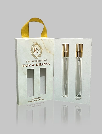
In the premium packaging industry, packaging is not merely product protection - it is the primary medium for conveying aesthetic messaging, brand value, and emotional impression. In this project, the owner of the perfume brand Allumere entrusted us with creating exclusive souvenir packaging for VIP guests at their wedding. The main challenge of this project was blending the luxury identity of a wedding held at a prestigious venue (Raffles Hotel Jakarta) with the character of the Allumere perfume brand. We took full, comprehensive responsibility for the client's needs, covering structural engineering, graphic and visual design, prototyping and mockup, as well as mass production and finishing. PACKAGING ENGINEERING & STRUCTURE A. Main Box Structure & Inner Divider Base Box: A folding box structure with extra reinforcement at the corners, featuring a top-bottom opening and a dedicated hole at the base as a channel for the ribbon handle. Inner Tray / Custom Divider: A precision tray with 2 arch cutouts specifically designed to hold 2 perfume spray bottles securely in place without shifting during transport. B. Outer Sleeve & Ribbons Outer Sleeve with Window Cutout: An outer sleeve with 2 vertical transparent die-cut windows, allowing recipients to see the perfume product directly without opening the packaging. Gold Satin Ribbon Handle: A sturdily attached royal-gold satin ribbon handle, functioning like a practical, elegant mini gift bag. VISUAL DESIGN CONCEPT & AESTHETICS The graphic design was crafted to radiate a romantic-luxury aura through an elegant minimalist approach. It features a soft warm cream marble texture with fine gold veining, the "FK" (Faiz & Khansa) monogram framed in a classic European-style gold ornate frame, and gold foil print accents. The front panel features THE WEDDING OF FAIZ & KHANSA, the event date, and the reception venue (9 August 2026, Raffles Hotel, Jakarta). The back panel tells the story of the perfume variants given as gifts: Bianca, "A soft whisper of romance and warmth," and Blaise, "An elegant touch of confidence and grace," alongside the event hashtag #KhanSaIDoFaiz, a thank-you message, and production credits. PROJECT WORK STAGES a. Consultation & Structural Concept: Analyzing the bottle dimensions, selecting a safe and aesthetic packaging type, and creating the dieline for the box, divider, and sleeve. b. Graphic Design & Layouting: Merging Allumere branding with Faiz & Khansa wedding elements while adjusting bleed and cutting margins. c. Prototyping / Mockup Production: Producing an initial 1:1 sample to test bottle fit, structural strength, and die-cut window precision. d. Mass Printing & Finishing: Precision offset color printing, matte lamination, gold foil stamping/embossing, die-cutting, folding, and ribbon assembly. e. Quality Control (QC): Inspecting box durability, print cleanliness, and the precision of every souvenir unit before handover. OUR SERVICE ADVANTAGES This project reaffirms our company's strength in providing a One-Stop Custom Packaging Solution: end-to-end service from structural research and visual design to physical mock-ups and mass manufacturing; high-precision customization tailored to the client's product; premium finishing and craftsmanship; and trusted execution for premium beauty and perfume brands such as Allumere.